acm rebrand
view here // repo here
This was a project to make the largest computer science club at UCLA, the Association of Computing Machinery, seem less elitist and more inclusive towards beginner programmers.
ACM had started to form an elitist reputation, but we wanted to make sure that ACM was seen as a place that welcomed people of all backgrounds, from beginner programmers to computer science veterans. Thus, the main theme for our rebranding was making computer science seem more approachable in order to expose computer science to people who had never heard of it as well as help increase diversity and inclusion in technology.
I worked on this project with three other people. In order to keep track of changes, we used Figma, which allowed us to upload assets from other platforms such as Adobe and Sketch. Figma also had own support to allow designers to create directly within the platform.
We first started on colors. We wanted to make much more friendly colors than the past, which had similar colors, but did not seem lively enough.
Here is the old design.
This was the old logo for the artificial intelligence committee, a committee that focused on artificial intelligence and machine learning.

This was the old logo for the hack committee, a committee that focused on teaching new developers new skills.

This was the old logo for the ICPC committee, which focused on the programming competition.

This was the old logo for the computer graphics committee, which focused on virtual reality, augmented reality, and computer graphics.

This was the old logo for the women’s committee, which focused on improving diversity and inclusion in technology.

Instead, we opted for brighter, livelier colors. We also added on different tints and shades.
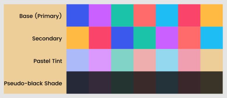
We tested how they would look on both black and white settings to ensure the aesthetic would remain the same.
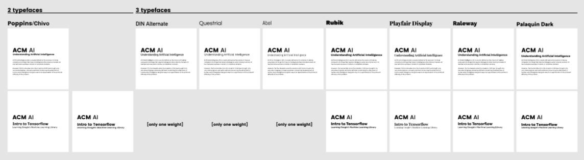
Next, we focused on the typography. We wanted fonts that seemed friendly and were easy to read.
We ultimately decided on using Poppins for our display font, Palanquin Dark for our header font, Chivo for our body font, and Space Mono for our code font.
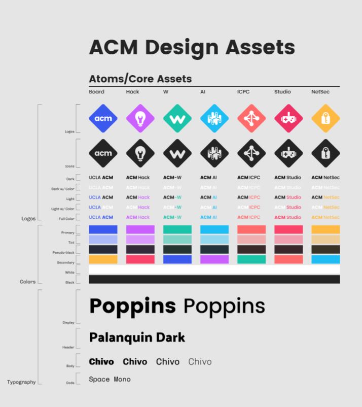
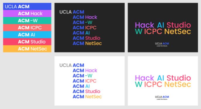
Then, we worked on developing new logos with a consistent component pattern.
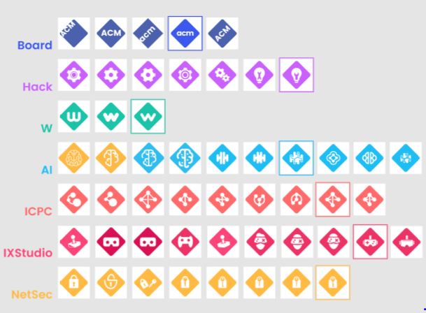
We went through many iterations, as can be seen here.
Then, we finally had our final assets that would be standardized across all our marketing and design material.
